.

Monday, December 12, 2011

Spiral Staircases


As our genre is Soft Sci-Fi/Thriller and one of our locations included a spiralling staircase, we decided to research the use of staircases in films of a similar genre.

Staircases are a convention of thrillers, and are mainly found in those that have a distinct psychological aspect. Recent prominent thrillers that have used them include "Inception" (top left) and Guy Ritchie's "Sherlock Holmes" (top right). Both of these stressed the psychological side of the plot, as well as involving action, elements that we are trying to emulate in our own film.

The Inception staircase is based on Escher's Klimmen en dalen (bottom left), and that is based on the Penrose Stairs, or the Impossible Stairs. The angle we used for our staircase shot makes it look almost like an optical illusion, as if the stairs could continue descending forever. Having Luke run down them suggests a more complex theme for our film; that there will always be good and bad sides to freedom of speech and that as long as everyone can say what they want, there will always be conflict, going round and round like the staircase.

Friday, December 9, 2011

'Franklyn' Film Poster Deconstruction


The poster for 'Franklyn' uses dull colours to emphasise the dark nature, and mood, of the film. The smoky texture and city image at the bottom (which includes Big Ben) is reminiscent of London during the Industrial Revolution. The texture of the poster is also quite grainy, and this shows that the film is not a clean and sharp picture, adding realism to it. The characters' costumes too use dull browns and greys, and even the light streak, which cuts across the poster, isn't excessively bright.

The expression of the two men tell the audience about their characters. Ryan Phillippe's character, who is centred with an aggressive slanting stance and a stern facial expression is obviously the more masculine of the men. Sam Riley's character looks more worried and has his hands in his pocket. His head is slanted forwards and he is looking up and out of the poster at the audience (the only character to do this). This gives the audience the impression that he is the more sensitive, or less masculine, character and that he is the character who the audience is likely to sympathise with.

The blending of the light, the characters and the city in the poster suggest a narrative that involves a less clear-cut sense of boundaries. Indeed, the narrative of the film is set in two “worlds”, present day London and a dystopian fantasy world, and the characters and narrative are intertwined between these worlds. The colour and font of the typography also blends into the grey and white lighting of the poster, with the three actor's names spaced above title of the film. The size of the spacing between the letters in the film title also suggests a fantasy, or sci-fi theme.

Tuesday, December 6, 2011

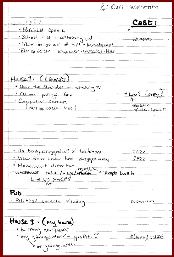
Our List and Planning: Shooting

As a group we took our favourite concepts out of all the ones we considered and made a list of each shot by location (this exercise also made us choose plausible locations), also listing the characters required.
Refined List Below:

As you can see some shots we are no longer using and other have moved location for conveinience (or, if upon further research and investigation, we found somewhere better asthetically or more equipt to our needs). These lists allowed us to critically evaluate the quality and quantity of shots we needed and refine our teaser concept. This was also the basis for our storyboards and filming schedule. Our ideas for casting followed shortly afterwards as we then knew what would be expected of each actor and who would be best for the role.

Make up Test

I did some bruise and cut make up tests before the shoot to familiarise myself with the techniques and choose a 'pattern' for the injury.
I used fairly cheap face paint which blended really well. I learnt a lot from the practise particularly that the colours had to be slightly more vivid, than needed in reality, to show up on the camera. (To see the research, click here.)

I started with a bruise on the arm.
I experimented with layering bruises of different age by having some greeny-yellow colouring at the edge of the injury.

Next I attempted a cut.


This looks more like a graze or abrasion but I felt it worked better for the situation we were filming that these were not open bleeding wounds.
I then practised doing facial bruising eg. a black eye, two grazes and split lip.


I felt that this was effective and somewhat naturalistic and so we decided to use the make up for the shots of our protagonist.

Monday, December 5, 2011

Casting Problems

Whilst trying to cast a presidential figure for our political speech our group met a number of problems such as:
- correlating free time,
- the location and
- finding an authoritative figure who looked the part.

These were minor issues however as the most significant difficulty was finding an adult who was willing to take part. One of the candidates we considered raised the point that the speech and set up, if filmed, put on the internet and taken out of context, could tarnish the reputation of the person who had read it.
For the point of our narrative the speech condemns the British media and removes public and private access to free speech in an Orwellian style future.

Fear of Footage Manipulation: Two of the potential actors for the presidential role were teachers and were strongly advised not to perform in our video for these reasons.
This highlights an interesting issue regarding the press and the power the media industry has to manipulate information, aided by the ever growing internet, and also edit original material distorting the truth. These teachers felt that their careers could be put in jeopardy in the future, implying, perhaps, that the media holds more sway over what we think and do than we would freely admit.
Solution: In the end we chose to film the full length speech because we had found a slightly younger actor who was willing to participate. After the speech was filmed we decided to edit it down, not only to reduce the length of the speech but also to remove some of the superfluous and more provocative phrases.
Younger actor:
The younger age of the actor portraying the politician actually worked in our favour.

The Double: - It created a new dynamic for the narrative as it seemed to imply the use of the double, typically a mythological or religious story idea (eg. Romulus and Remus, Cain and Abel etc.) which has become a  prevalent convention in gothic horrors, fantasy and thriller narratives.

Comparisons: - It subtly provokes the audience to compare and contrast the two characters and creates an almost preordained conflict.

Not Right Verses Wrong: - Coupled with one of our potential taglines, the inter-texual phrase, ‘One man’s terrorist is another man’s freedom fighter’ we hope to intimate that there are two perspectives of the dystopian world and not simply that one is wrong and one is right.
Jon, our actor, could be aligned in appearance to our current Prime Ministers which helped to add  depth and reality to the shots of the speech. We explored the concept of Prime Minsiters in life and film here.
[David Cameron (Left), Nick Clegg (Middle), Jon (Right)]
They all have:
- dark hair neatly styled,
- pale skin,
- slim built,
- clean shaven and 
- middle aged or younger.
We aimed to dress Jon in a similarly smart way as well for authenticity.

Friday, December 2, 2011

Death Note

Whilst there is a film adaptation of the Death Note manga series, the manga gives a stronger sense of the gritty, dystopian future that we are trying to capture. The first volume was published in 2003, but the world was set in 2006-11, giving it the Soft Sci-Fi element that we ourselves are using. Death Note is a manga created by writer Tsugumi Ohba and manga artist Takeshi Obata. The main character is Yagami Light, a high school student who discovers a supernatural notebook, the "Death Note", dropped on Earth by a god of death, or a shinigami, named Ryuk. The Death Note grants its user the ability to kill anyone whose name and face they know, by writing the name in the notebook while picturing their face. The series centers around Light's attempt to create and rule a world "cleansed of evil" as "God" using the notebook, and the efforts of a detective known as L to stop him.


LIGHT YAGAMI
Technically, Light is the protagonist of the Death Note series, but as a result of its highly complex storyline, it depends entirely on the reader’s character interpretation and beliefs as to whether he’s the protagonist, or L, Near and Mello’s antagonist. He is a highly intelligent Japanese student, disillusioned with life, who takes a chance to try and make the world into what he believes will be a better place, by killing off evil-doers as the self-declared god, Kira. The plotline follows him as his personality and morals become corrupted, and he slowly goes insane; he must kill L and L’s heirs before they can unmask him and find proof of his murderous ways.
As Light leads the world-dominating, fear-controlled dystopia, in regards to our own plot, he would be the antagonist. He fits the image of the antagonist from the other films that have deconstructed; he is a highly charismatic, highly intelligent young man who dresses smartly and manipulates and uses everyone around him to create his image of the ideal world.


L
In regards to our narrative, as Light would be considered the antagonist, L would be the protagonist. L is an eccentric recluse and the world's greatest detective. He is called upon when "Kira" starts mass-murdering, and makes it is personal quest to stop him. He spends several years working closely alongside Light in a secret battle of wits; L knows Light is Kira, and Light knows that L knows he is Kira, and so the race begins to discover who can catch other out - and kill them - first. In terms of appearance, he is not a stereotypical resistance-leader, however, one of his heirs, Mello (pictured below) fits the typecasting better. He does have the intelligence, physical capabilities and emotional detachment associated with the role though. 


Mello
As previously stated, Mello fits the "rebel" archetype much more than L; he is conventionally attractive and physically fit, emotionally detached, and with enough intelligence and a strong enough personal vendetta against the antagonist to stage an effective revolution. He also wears dark colours, leather jackets and sunglasses, superficial trademarks of the rebel archetype


Misa and Takada
Misa is Light's girlfriend and, later, fiancĂ©e, and fits the love interest archetype insofar that she wears tight, dark clothes, is conventionally attractive (she is an actress and a model) and aids Light with his cause. She is very emotional and fiercely loyal, which enables Light to horrifically manipulate her. When compared to the hyper-intelligent men she is surrounded by, she is perceived to be rather stupid and superficial, and more of a burden than helpful; however as she is an incredibly proficient actress, her perky goth "Misa Misa" personality has been widely debated to be merely an act, to avoid suspicion. Takada, the news anchor that Light begins an affair with and eventually murders, fits the archetype better as she is calm and highly intelligent, as well as being dark and conventionally attractive 


Initial Poster Designs

This is our poster idea based on the poster from The Ides of March. The faces of our protagonist and antagonist don't fit together quite as well as Ryan Gosling and George Clooney's, however it could be made to look more effective if we have Jon's face on a TV screen, or Luke's on a wanted poster, like how Clooney's is on a magazine.


These are our poster ideas based on the album cover of The Saints Are Coming. We also tried it in black and white, and found it was more effective because it highlighted the red of the flag and rebel symbol. This would be more of a billboard advert, however, than a poster. To incorporate this idea into a poster we'd have to change the layout significantly.


These are our poster designs based on the posters for In Time. Again, the black and white faces with the colour backgrounds highlights the red, and we would possibly produce another one with a third slogan for our secondary protagonist, Jazz.