.

Friday, December 23, 2011

'Blade Runner' Semiotics

Each of the main characters is associated with an animal.
Roy - is both a wolf and a dove,
Rachael - is connected to the spider,
Tyrell - Owl and
Deckard - to sushi (raw fish) and the unicorn.

Each creature also carries connotations of character:
Roy’s dove - a link to his final scene in which he holds a dove – a symbol of peace and often the soul, it flies from his hands when he dies.
Significance? the slow extinction of Earth’s natural animals and their replacement by replicants.
- Human fears replicants replacing all humans
- Or the preciousness of each individual, as once they are extinct (dead) nothing again will be exactly like them.
- In fiction,(for example His Dark Materials by Philip Pullman), the soul’s outward appearance often has that of an animal. The Point: Replicants have souls too despite their unnatural creation.


The chess game between Tyrell and Sebastian:
Uses the conclusion of a game played between Anderssen and Kieseritzky (London, 1851). It is considered one of the most brilliant games ever played, and is universally known as "The Immortal Game".
Symbolism?
- The concept of immortality 
- Represents the struggle of the replicants against the humans: the humans consider the replicants pawns, to be removed one by one. 
- Or it represents the game between Tyrell and Roy who is stalking Tyrell. 


Eye symbolism is also a key part of the narrative shown through images of:
    - The eye in the opening shots
    - Replicants' eyes glow
    - Tyrell has huge glasses to make his eyes bigger
    - Eyes are used in the VK test to examine pupil dilation and seek emotional reactions/lies
    - The first person the replicants go to is Chew, at the Eye Works, who makes the Nexus’ eyes. He says "Eyes, eyes... I do only eyes"
    - Roy replies "Chew, if only you could see what I've seen with your eyes!" 
    - Leon tries to stick his fingers in Deckard's eyes and Roy kills Tyrell by sticking his thumbs in his eyes
    - Roy says "I've SEEN things you people wouldn't believe” and "I wanted to SEE you"

The film’s theme, the quest for immortality, is linked to the ever-present eye motif:
- eyes are the windows to the soul, and only the soul is immortal 
- The replicants’ underlying humanity is displayed through showing their ‘souls’ in this way, as well as through their attachments to each other.   
There is also a lot of religious symbolism within the narrative. Roy, who is shown to have a dual nature, is shown on the one hand to be Lucifer and the other replicants are fallen angels because they were inherently benign creatures who became violent only through the neglect of a corrupt society. 
Roy paraphrases part of William Blake’s “America: A Prophesy” which supports the theory that the replicants are representing the fallen angels.
Roy:  "Fiery the angels fell, // Deep thunder roll'd around their shores // Burning with the fires of Orc." 
Blake: "Fiery the angels rose, // And as they rose deep thunder roll'd // Around their shores: indignant burning with the fires of Orc."


In the light of this idea the screenwriter plays with the idea that these human creations show us more about the ugliness of man then they do of the created.
On the other hand, Roy can be shown to be Christ. As he begins to cramp and die Roy puts a nail through his palm – a symbol of crucifixion. The society was not ready for replicants on Earth and so programmed them to die after only a glimpse of the world. When Roy dies it is a release from his torment. 

V for Vendetta

Set against the futuristic landscape of totalitarian Britain, V For Vendetta tells the story of a mild-mannered young woman named Evey who is rescued from a life-and-death situation by a masked man known only as “V.” Incomparably charismatic and ferociously skilled in the art of combat and deception, V ignites a revolution when he urges his fellow citizens to rise up against tyranny and oppression. As Evey uncovers the truth about V’s mysterious background, she also discovers the truth about herself – and emerges as his unlikely ally in the culmination of his plan to bring freedom and justice back to a society fraught with cruelty and corruption.


V
The masked vigilante known only as codename “V” is an eloquent, hyper-intelligent and incredibly cultured man who was horrifically tortured and experimented on, and as a result gains impossibly fast reflexes and fighting skill, and an unstoppable vendetta towards the corrupt Fascist government.
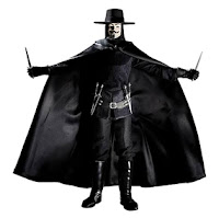
His costume consists of an iconic Guy Fawkes mask, which he wears at all times, a long brunette wig, a black Guy Fawkes hat, a long black cloak, and black tunic, gloves, trousers and boots. The mask and the emphasis on the black add to his air of mystery, whilst remaining practical and allowing him to be camouflaged in darkness. The mask connects him to his inspiration, Guy Fawkes, but also gives the viewers a human face to connect with, whilst the large grin adds an unnerving quality to the scenes of violence.


High Chancellor Adam Sutler

Sutler is the leader of the Norsefire party and the dictator of Britain in the dystopian future. He lives in an underground bunker in self-imposed exile and leaves the day-to-day operation of his empire to his lieutenants. For most of the film he is only seen on television, until the end when he finally appears in person. He reaches the position of Prime Minister by promising to restore order to the country after terrorists supposedly killed 80,000 people with a self-ignited bioweapon that created a viral epidemic - a bomb that he planted himself. Sulter is conniving and manipulative, but his erratic temper and increasingly extreme measures of "keeping peace" cause even his subordinates to turn on him. His name is a portmanteau of his name in the comics, "Adam Susan" and "Hitler", an indication of the sort of politician he is supposed to evoke connotations of. 


Evey Hammond

Every is a strong, intelligent, emotional woman who acts as the moral core of the narrative. V saves her from an attempted rape, leading her to attack an officer of Norsefire to save his; he hides her in his underground palace of contraband artifacts, and although she is afraid and wary of him, she soon learns to sympathise with his cause. She is not so much the "romantic interest" - although V does confess to having fallen in love with her shortly before he dies - as a secondary protagonist, but she has the classic traits associated with that role. She is young, attractive and incredibly loyal, enduring weeks of psychological and physical torture to keep V's whereabouts hidden, emerging from it completely "fearless".


Symbolism

V's rebellion symbol is a bright red "V" cutting through a circle, reminiscient of the anarchy symbol. The bold red on the black again brings connotations of blood and violence. The symbol is also the most iconic, memorable and well-known part of both the trailer and the film, as it is seen scrawled and painted all over walls and propaganda posters. We tried to replicate its iconic nature in our own rebel symbol.

The Norsefire symbol is a red on black double-barred cross shape, resembling the Croix de Lorraine. Again, the colours invoke blood and violence; the Norsefire party are obsessed with patriotism ("As always, England prevails!"), and their symbol is very similar to the English flag, but with black instead of white. This inversion suggests how England has been corrupted.


'Gattaca' Semiotics


Semiotics:
Vincent’s dreams to go to space are symbolic of his high aspiration,
-a metaphor showing his desire to ignore the limit society has given him, the sky is not his limit (in contrast with the saying).
- Stars are a global symbol of wishes or dreams.

motif of identification and being categorised.
- a catalyst of much of the film’s tension,
- serves to emphasise this society’s aim to remove individualism.

The advanced scientific technology (for Vincent to hide his true identity) is not so far removed from that available today that the words from the beginning of the film “In a not too distant future” ring true and the audience’s disbelief is suspended.

Futuristic conventions: - the technology
- the clean and clinical looking environments 
- remind the audience of a science lab implying that the whole world is now scientifically focussed.
Jerome’s silver medal is symbolic of his perceived short-comings and of the world that made him feel that way.
It is significant therefore that in the final image of Jerome he reclaims the medal as a possession of pride and it is the last thing the audience is shown of him.
There is also a motif of light and dark :
- hints at secrecy and mystery.
- brighter, naturally lit scenes are generally those in which Irene and Vincent connect.
Action Sequences: As a thriller tension and mystery are generally substitutes for actual action.
The only really violent scene, the murder of Gattaca’s mission director, is not shown on screen. In one scene Victor attacks a policeman in order to escape. This is in contrast with his almost continuous composure in ‘public’ and is therefore all the more surprising.

Wednesday, December 21, 2011

Minority Report Trailer Deconstruction


The trailer for Minority Report starts immediately into the action of the film. A low angle shot is used to show four 'officers' from 'Pre-crime' crashing through a skylight window into a house and apprehending a felon for committing murder before he has actually committed the crime. A close up of the main officer singles out actor Tom Cruise as the protagonist as he arrests a man for the “future murder” of his wife. Due to this opening, the film's genre is apparent as a Sci-Fi Thriller straight away. Emphasis on the action element of the opening is put on by the lack of music, which fades in but remains quiet throughout the scene. A blue tint effect is used throughout the trailer to further show the futuristic, sci-fi, element of the film's narrative.


A black screen follows the 'arrest', in which bold white anchorage is used to explain that “The Future Can Be Seen / The Guilty Punished / Before The Crime Is Ever Committed”. The use of “The System Is Perfect / It's Never Wrong” and a law enforcement style badge/logo indicates the film is set in a controlled society, whereby the “Department of Precrime” has the power to arrest criminals before they commit a crime.

The shot then zooms in on the logo to show three people who seem to be connected through telepathic monitors, highlighting the sci-fi genre via futuristic technology. The shot zooms further until it reaches the eye of one of them. At this point anchorage fades in saying “Until It Comes After You” and the shot changes to Tom Cruise's character, now in casual clothes, being told not to run. It is clear to an audience that he has become a victim of the system and as protagonist, an audience should sympathise with him.


Cruise's character then replies “Everybody runs” and the music swells and speeds up, which is then coupled with a series of fast paced straight cuts that depict several action scenes of the film. During these cuts Tom Cruise's name flashes up to signify the importance of his character and also his name in drawing in a potential audience of the film. Steven Spielberg's name as director also has this effect and is displayed after Cruise's. Another series of straight cuts from the film begins and speeds up along with the music and ends with a banging sound and a new screen with “Minority Report”. The block font, shiny metallic colour and use of the “Department of Precrime” logo as the 'o' in “Minority” brings emphasis to the film's sci-fi genre, as well as its focus on futuristic law enforcement.


1984: Semiotics, Gang Culture and Speeches

Semiotics:
-          Use of light and dark during scenes to illustrate Winston’s struggle for truth in a world of ‘Untruth’. Light is used to emphasise the loveliness of the fields and nature but is also seen to be used deceptively through the constant uncomfortable light in the torture rooms.
-          Crossing arms over their heads, a symbol for Oceania, shows their conformity.
-          In the announcements the Party use a “cancer” metaphor for Goldstein and the Brotherhood
-          Big Brother’s face is present in nearly every scene either on the telescreens or as a poster and intimates the oppressive nature of ‘His’ regime. He is made almost God-like through the repetition of his image.
-          Eyes watching are a symbol seen throughout the film. Either they hint at the rebellion of certain characters, connecting them because eyes cannot lie or to highlight the constant surveillance. There is even a POV shot looking out of the telescreen to impress this.

-          The monotonous grey and dilapidated buildings have implications of jails/prisons and can be seen as a metaphor for the character’s imprisonment.
-          The red ‘V’ for Victory is the symbol of Ingsoc., The Party, and can be seen on posters, flags and gin bottles, constantly presenting a false ideology to the society.

-          Glasses, worn by principal characters O’Brien and Winston, are supposed to make you see clearly. This idea presents the debate as to which of these characters sees the truth as they act as foils for one another.
-          There is a motif of mortality, introduced and repeated by Winston who signs his first diary entry “from a dead man”. This foreshadowing is used to create tension but could also imply that the characters are not alive, not living, they merely exist in the world (although O’Brien believes that even that is not the case).
-          The numerous ‘Newspeak Dictionaries’ should be enhancing communication but actually it is being reducing it because of the Party’s sinister motive of reducing words.
-          Acts to dehumanise can be seen and heard presented through announcements, for example control of natural impulses like sex. This then becomes an act of anarchy.
-          Julia’s handwritten note and Winston’s diary highlighting their wish to communicate and connect. They are also symbols of rebellion of thought and feeling.
-          The coral paperweight, which is an object meant just for beauty alludes to the perception of the beauty of the past (before Big Brother). The coral is suspended, unchanging in glass, potentially a metaphor for Julia and Winston’s fragile state as they try to exist outside of the Party. Nothing about the ‘new’ world is real, but the old object Winston explores is presented through the senses and makes them seem more real to him. This interest in the ‘Old’ world is a form of rebellion and so in some ways the coral is a symbol of this rebellion. Later in the film it is smashed when Julia and Winston are caught.

-          There is a Chess board around which Winston sees those who are already beaten by society sitting around it (later he would find himself in that very place. This highlights the unwinnable nature of the game the Party plays and that all the characters are just pawns with no actual control.
Anarchy and rebellion are not overtly seen in ‘1984’ because it is not particularly physical; the battle for freedom is mainly on an emotional and psychological level.
Gang culture and graffiti:
-          There is a mob mentality displayed by the masses due to their indoctrinated of hateful ideas leaving them incapable of free thought.
-          One moment the crowds are riled into hate – shouting and displaying violent emotions, almost animalistic in their actions and then, the next they are chanting in rapture the word “Big”, praising Big Brother (cultish). These extremes of emotion are dictated by the speeches.
-          The unity of the masses is highlighted visually by the timed marching and uniform dress code which further presents the oppression.
-          There is not graffiti despite the dilapidated appearance of the city but Big Brother’s posters appear everywhere.
-          There is constant radio and screen announcements used to incite hatred (It is even named the ‘2 Minute Hate’. The main aim of these speeches and, indeed, the telescreens are to show propaganda videos and inspire love for Big Brother and patriotism.

Tuesday, December 20, 2011

Universal Pictures International - Sales and Distribution Work Experience Part 2

I also spent the day at the Picture Production Company (PPC) which cuts and edits trailers and creates graphics and typography.
Before a trailer is made a Promo is edited.
- a video is a 3-8 minute outline of the whole film's narrative
- used to pitch the film.
- then condensed for a trailer according to a short brief written by the client.
Mostly editors have a lot of creative input and they select the clips either from ‘dailies’ (daily film reels whilst filming is still in progress), which is why things may appear in trailers and not in the final cut, or from a finished feature film, but this is uncommon.
I was told that the clients usually want to push their best bits into their trailer which is why trailers often end up showing too much. However, sometimes clients specify moments or narrative or characters which they wish to conceal. By reducing what can be shown the client and editor aim to tease the audience with enigmas.
The UK and Europe often have very different trailers to the US because they are more trusting in the intelligence of the audiences in the European markets. An example of this is ‘The Eagle’ trailer, which was released in both the US and the UK but whilst in production it was the US who wanted more text for narrative explanation.
When asked the editor I spoke with at PPC said that music was the most important component of a trailer.
He thought that bad trailer gimmicks were:
- overly quick cutting,
- not a lot of shots shown or narrative content and
- using lots of fades to black throughout the trailer.
All trailers, once refined, are checked by the certificating company who give input and ask for some things such as violence, swearing and smoking to be cut.
America have recently rethought the general green label for trailers, to show that they have been approved by the ‘Motion Picture Association’ and have introduced a red, possibly to be followed by a yellow, label to indicate that an internet trailer is “approved only for age-appropriate Internet users”. This is a way of identifying content that may be offensive such as violence, sex, language or trailer intensity.

Universal Pictures International - Sales and Distribution Work Experience

I went for a one week work experience placement at UPI, in London, in the Sales and Distribution area which works on the promotional packages and marketing for Universal films across the world, liaising with headquarters in the US and Japan.
The promotional packages include:
- all posters (Bus side, Billboard, Premiere, Cinema, 3D cardboard cut outs, Magazine, Character and Collector) and
- all trailers (Teaser, Theatrical, TV spots, Radio and Online) for each ‘territory’.
A ‘Territory’ is decided by language (and a poster/trailer’s need for translation/ subtitles/dubbing). For example, France is counted as 2 territories because parts speak Swiss-French and others Dutch-French.
The commercial process of creating posters has to conflicting objectives: CREATIVE verses LEGAL.
For contract reasons certain actors need to appear at certain sizes and with names in a certain order. Confirmation is needed from the Director and the actor before images can be used.
Each territory has poster preferences in order to create different social responses. See the examples from the 2010 reimagining of ‘The Wolfman’.
UK – Emily Blunt is a British star, Conventions of a supernatural Horror (eg. full moon, mist, forests, isolated vulnerable girl), monster is shrouded in mystery – one of the film’s hooks

French – Creates an ambiance of a thriller or mystery. The implication is that the narrative is sophisticated and character driven.
This poster (possibly Turkish) highlights the Romance element of the narrative and shows their relationship to be of importance. These actors may also be hooks to see the film.
Japan (which is the only country which Universal lets have complete creative control over their production material because Japanese culture is very different to the rest of the world)
 – This poster fits conventions of supernatural but the splashes of red have slasher connotations as well. However, the middle text actually explains most of the narrative (even one of the main plot twists) which implies that the story is in some ways prophetic.


This poster of ‘The Unborn’ (2009)  appears with a skirt on (in varying lengths) for some Asian countries, for example Malaysia.


Posters must conform to convention to indicate the genre but also subvert the viewer’s expectations and be in synch with the trailers, usually through colour or motif.
Feedback and revision of posters happens in small groups with the director, this is to gauge audience perception and the success of the work. [Cost is crucial to what can be produced.]
When I enquired as to what was considered a ‘bad poster’ the team suggested ‘floating head’ posters because they do not effectively convey anything except the actors who will appear in the film.

Each of these posters are for the same film yet show it from completely different angles.
UPI explained that different film angles sell better in different nationalities. For example, in Japan emotion is key, and in Asia explosions and action are popular.
Even in one country each poster series for a film may show it differently. Sometimes this is to attract different demographics.
For the demographics populations are divided into 4 categories:
In some countries posters may vary for social reasons. In the UK guns can appear on posters but cannot be pointing out of the poster. In some countries tolerance for nudity, guns and smoking is different and sometimes removed to avoid offense.

Thursday, December 15, 2011

Warehouse Mise En Scene


For our warehouse shot of the rebel headquarters, we set up a desk and spent a long time working on the mise-en-scene. We included chess pieces, among our props, to allude to the symbolic use of them in Tinker Tailor Soldier Spy and Bladerunner, two of the films that greatly influenced us. They have connotations of war being about strategy and almost like a game in that both sides are playing the other. The laptop was used to link in modern technology, as our film is set in the near future, and a convention of sci-fi is that there is future technology involved. The maps and documents suggest the idea of manoeuvres in war and again, links to the idea of strategy being involved. We also included several pencils and pens, as well as open files and screwed up paper to show that the desk has been worked at and make it look more realistic

Tuesday, December 13, 2011

Website Background Creation


These are the videos we created to go in the background of our Government/Rebels pages on our website. We used static to break up images and this links the pages to our trailer and gives it a disjointed feel

Filming the TV Shot


We needed a very specific television-sofa layout for the shot where Luke, our protagonist, watches the political speech, so we decided to use Laura's living room as there was a decent sized TV and the sofas could be easily rearranged. The walls and sofa were also neutral colours, which meant that they would not draw attention away from Luke and the TV screen.


After setting up the mise-en-scene in terms of the room, we turned our attention to Luke; we asked him to wear the same clothes he wore for the other shots of him, to keep a sense of continuity and minimise confusion to viewers. As this shot was a close-up of his face, we decided to experiment using our injury research. With basic make-up and a face-painting kit, Hannah managed to create a very realistic black eye, broken nose and split lip for Luke - we tested how convincing it was by posting the photograph on Facebook without explaining that it was fake, and monitored the responses. Everyone was very shocked to find out that it wasn't real, which was a real encouragement!